
Growth Architecture Insight
Landing Page Conversion Optimization: Why More Traffic Is Often the Wrong Fix
Why landing page conversion optimization often creates more growth than buying additional traffic, with a practical framework for finding friction.

The campaign is working.
Traffic is rising. Cost per click is stable. The ads are attracting the right searches.
Yet the sales pipeline is almost empty.
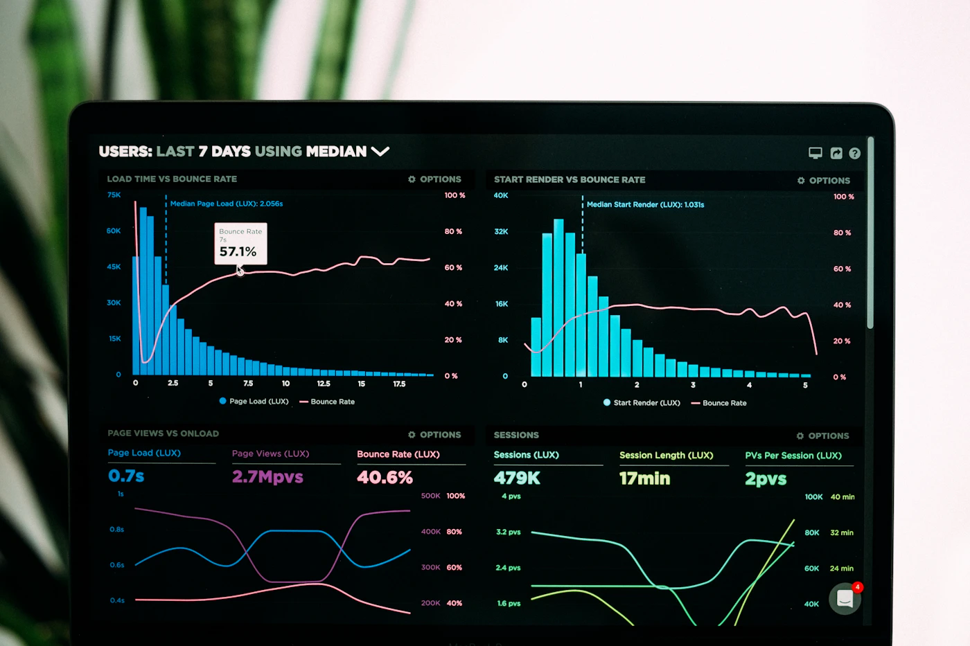
Visitors arrive, pause for a few seconds, scroll halfway down the page, and disappear. Some open the form. Few submit it. Others call, ask a basic question the page should have answered, and leave unconvinced.
The problem is not always traffic.
Sometimes the page is quietly wasting it.

Landing page conversion optimization is the process of improving a page so more visitors complete a meaningful action, such as making a purchase, submitting a qualified enquiry, booking an appointment, or starting a trial. It combines message clarity, user intent, trust, usability, testing, and accurate measurement—not merely changing button colours.
A high-converting landing page does not pressure everyone into acting.
It helps the right visitor understand the offer, trust the business, and take the next step with less hesitation.

What is landing page conversion optimization?
Landing page conversion optimization, often called landing page CRO, is the systematic improvement of a page’s ability to turn visitors into customers, leads, subscribers, applicants, or booked appointments.
The work may involve
- Clarifying the offer
- Matching the page to the traffic source
- Improving headlines and copy
- Strengthening trust signals
- Reducing unnecessary friction
- Simplifying forms
- Improving mobile usability
- Increasing page speed
- Clarifying calls to action
- Testing different page elements
- Measuring lead and sale quality
- Removing distractions
- Addressing objections
The goal is not simply to increase the percentage of people who click a button.
It is to increase the percentage who complete a commercially useful action.
That distinction matters.
A shorter form may produce 30% more submissions while flooding the sales team with unqualified enquiries. A dramatic discount may lift purchases while cutting margin. A forceful pop-up may improve short-term signups and damage trust.
More conversions do not automatically mean better business.
How do you calculate a landing page conversion rate?
The basic formula is simple
Conversion rate = Number of conversions ÷ Number of visitors × 100
If 1,000 people visit a landing page and 50 complete the target action
50 ÷ 1,000 × 100 = 5%
The page has a 5% conversion rate.
But the formula becomes less useful when the conversion itself is poorly defined.
Consider these actions
- Clicking the phone number
- Starting a form
- Submitting a form
- Booking a consultation
- Attending the consultation
- Becoming a paying customer
All six may be tracked.
They are not equally valuable.
A strong conversion optimization programme separates micro-conversions from primary business outcomes.
Conversion type
Example
What it tells you
Engagement signal
Scroll, video view, button click
The visitor showed interest
Intent signal
Form start, pricing-page view
The visitor considered acting
Lead conversion
Form submission, phone call
The visitor made contact
Qualified conversion
Approved lead, booked consultation
The visitor matched business criteria
Revenue conversion
Purchase, signed contract
The activity created revenue
Profit conversion
Sale after costs and refunds
The activity produced financial value
A page that increases form submissions but reduces qualified-lead rate may not have improved at all.
It may have made the wrong action easier.
Why landing pages fail to convert
Most poor landing pages do not fail because of one catastrophic mistake.
They fail through accumulation.
The headline is slightly vague. The offer is slightly confusing. The form asks one question too many. The testimonials sound generic. The page loads slowly. The mobile layout feels cramped. The call to action is easy to miss. The visitor is expected to work out what happens next.
None of those problems looks fatal on its own.
Together, they create doubt.
And doubt is expensive.
The message does not match the visitor’s intent
Imagine someone searches
Emergency boiler repair near me
The ad promises
Same-Day Boiler Repair
The visitor lands on a homepage with the headline
Complete Home Comfort Solutions
Below it are sections about air conditioning, annual maintenance, commercial installations, smart thermostats, and company history.
The business may offer emergency boiler repair.
The page makes the visitor search for proof.
That is a message-match failure.
Strong message match connects four elements
- The search or traffic source
- The advertisement or link
- The landing-page headline
- The promised next step
The closer these elements align, the less mental effort the visitor must make.
A good landing page answers three questions almost immediately
- Am I in the right place?
- Can this business solve my specific problem?
- What should I do next?
If the answer requires careful reading, many visitors will leave before finding it.
The headline describes the company instead of the outcome
A headline such as
Innovative Solutions for Modern Businesses
could belong to a software company, consultancy, logistics provider, bank, or office-furniture supplier.
It sounds polished.
It communicates almost nothing.
A stronger headline identifies the problem, audience, offer, or result.
Compare
Weak headline
Stronger headline
Quality Legal Services
Fixed-Fee Employment Advice for Small Businesses
Smarter Marketing Solutions
Generate Qualified Roofing Leads Without Long-Term Contracts
Healthcare You Can Trust
Same-Week Physiotherapy Appointments in Bristol
Build Your Future
Accredited Cybersecurity Training for Career Changers
The stronger versions are not necessarily more beautiful.
They are more specific.
Specificity helps the right visitor recognize relevance quickly. It also discourages unsuitable visitors from converting, which can improve lead quality.
The offer is difficult to understand
Visitors should not need a meeting to understand what the page is selling.
An unclear offer often hides behind phrases such as
- Tailored solutions
- End-to-end support
- Industry-leading service
- Bespoke strategies
- Next-generation technology
- Comprehensive assistance
- Results-driven solutions
These expressions may sound safe because they avoid making a narrow claim.
They also avoid saying anything memorable.
A clear offer explains
- What the visitor receives
- Who it is for
- What problem it solves
- How it is delivered
- What it costs, when practical
- How long it takes
- What happens after the visitor responds
For example
Book a 30-minute Google Ads audit and receive a written list of wasted-spend issues, tracking errors, and priority optimizations within two business days.
The visitor understands the service, format, duration, deliverable, and timeline.
Clarity reduces suspicion.
The page asks for commitment before earning trust
A visitor arrives from an ad and immediately sees
Schedule Your Strategy Session
The page has not explained the strategy.
It has not shown who will conduct the session.
It has not established why the business is qualified.
It has not said how long the call lasts, whether there is a fee, or what happens afterwards.
Yet it asks for the visitor’s name, phone number, company, revenue, budget, number of employees, website, and preferred appointment time.
That is not a form.
It is an interrogation before introductions.
Match the request to the visitor’s readiness
Visitor stage
Suitable call to action
Early research
View pricing, download guide, compare options
Problem aware
See how the service works
Evaluating providers
Request quote, view case study
Ready to act
Book appointment, start trial, purchase
High urgency
Call now, request immediate help
Not every visitor should be pushed toward the same action.
A person reading a detailed comparison may not be ready to book a sales call. Giving them a lower-commitment next step can preserve the opportunity without forcing a premature decision.
The page has too many competing actions
Many landing pages behave like miniature websites.
They contain
- Full navigation
- Multiple service links
- Social-media icons
- Blog links
- Newsletter forms
- Live chat
- Phone numbers
- Download buttons
- Several different calls to action
- Footer links to unrelated pages
Choice can feel helpful.
Too much choice creates escape routes.
A campaign landing page should usually have one primary conversion goal.
That does not mean every button must use identical wording or that all secondary information should disappear. It means the page should guide visitors toward one clear outcome.
For example
Primary action: Book a consultation
Secondary support: Call with a question
Trust-building links: Privacy policy, terms, credentials
The page should not simultaneously encourage the visitor to subscribe, follow the company on Instagram, browse ten services, read the blog, download a checklist, and request a quote.
Attention is finite.
Spend it carefully.
The form creates unnecessary friction
Every form field asks the visitor to pay with time, effort, and personal information.
Some fields are necessary.
Many are inherited from a sales process nobody has questioned in years.
Before keeping a field, ask
- Is this information needed before the first conversation?
- Can it be collected automatically?
- Can it be asked later?
- Does it help qualify the lead?
- Will removing it damage sales efficiency?
- Does the visitor understand why it is required?
Fields that often create avoidable friction
- Full postal address for an initial enquiry
- Annual revenue before trust is established
- Large open-text fields
- Requiring account creation before contact
- Asking for information already contained in the URL or campaign
- Separate fields for information that could be combined
- Mandatory phone numbers for email-only resources
- Complex password rules during a trial signup
Shorter forms often convert better, but not always.
A private school may need enough information to determine year-group availability. A commercial lender may require financial details. A B2B service may prefer fewer, better-qualified leads over a larger volume of weak enquiries.
The correct form is not the shortest one.
It is the shortest form that still supports the next business decision.
Trust arrives too late
Some landing pages place all credibility information near the footer.
By then, the visitor has already encountered a bold promise, a large form, and several calls to action without seeing evidence that the business is legitimate.
Trust should appear close to the moment doubt begins.
Useful trust signals include
- Recognizable client or partner logos
- Verified reviews
- Specific testimonials
- Professional licences
- Security information
- Clear pricing
- Refund or cancellation terms
- Real team photographs
- Physical business details
- Industry memberships
- Case-study results
- Years of relevant experience
- Media references
- Privacy information
- Guarantees with clear conditions
Specific testimonials outperform applause
This testimonial is weak
Amazing service. Highly recommended.
It could describe a restaurant, accountant, builder, or dog groomer.
A stronger testimonial says
We reduced missed appointments within six weeks, and the booking team now spends half as much time chasing incomplete enquiries.
The second version explains
- The original problem
- The outcome
- The timeframe
- The operational benefit
Believable detail is more persuasive than enthusiastic punctuation.
The page makes claims without proof
Claims are easy to write
- Number-one agency
- Best-in-class service
- Guaranteed results
- Trusted experts
- Leading provider
- Unmatched quality
The visitor has seen all of them before.
Proof can take several forms
Claim
Better supporting evidence
Experienced team
Named specialists with relevant backgrounds
Fast service
Published response or delivery times
Proven results
Case studies with context and dates
Trusted provider
Verifiable reviews or accreditations
Easy process
A clear three-step explanation
Secure platform
Specific security practices or certifications
Better performance
Before-and-after data with methodology
Avoid proof that raises more questions than it answers.
“Generated 700% growth” sounds impressive until the visitor learns the business increased sales from one order to eight.
Context protects credibility.
The mobile experience is treated as a smaller desktop page
A page may look polished on a large monitor and become exhausting on a phone.
Common mobile problems include
- Oversized headings
- Tiny body text
- Buttons too close together
- Forms wider than the screen
- Sticky elements blocking content
- Slow-loading images
- Important information buried below large hero sections
- Chat widgets covering calls to action
- Telephone numbers that cannot be tapped
- Dropdowns that are difficult to use
- Excessive animation
- Long, uninterrupted paragraphs
Mobile optimization is not simply responsive resizing.
It requires prioritization.
On a smaller screen, the page should make the most valuable information easier to access, not merely narrower.
A strong mobile opening usually contains
- A clear headline
- A brief explanation
- One primary call to action
- One or two trust signals
- No obstructive pop-ups
- Fast access to phone or booking options where relevant
The visitor should not need five swipes to understand the offer.
Page speed affects patience and trust
A slow page creates uncertainty before the content appears.
The visitor taps the ad.
Nothing happens.
The screen shifts as images load. The button moves. A consent banner arrives. A video begins buffering. The visitor presses back.
The business pays for the click anyway.
Common causes of slow landing pages include
- Oversized images
- Autoplay video
- Too many tracking scripts
- Heavy page builders
- Unused JavaScript
- Excessive fonts
- Third-party chat tools
- Complex animations
- Poor hosting
- Redirect chains
Performance optimization should not be pursued as an abstract technical score.
It should be viewed as friction reduction.
Compress images. Remove scripts that do not support a real decision. Delay nonessential tools. Test the actual page on ordinary mobile connections, not only fast office Wi-Fi.
Calls to action should describe the next step
Buttons such as
- Submit
- Continue
- Learn more
- Get started
are not always wrong.
They are simply vague.
A stronger call to action can explain the value or next step
- Get My Free Quote
- Check Appointment Availability
- Start My 14-Day Trial
- Request a Campaign Audit
- Compare Plans
- Download the Pricing Guide
- Speak With a Specialist
The wording should match what actually happens.
Do not label a button “Get Instant Access” when the visitor must wait for manual approval.
Do not promise a “Free Consultation” if the call is mainly a sales qualification exercise.
Surprise creates mistrust.
Objections should be answered before the visitor leaves
Visitors rarely arrive as blank slates.
They bring concerns
- Is this too expensive?
- Will this work for my situation?
- How long will it take?
- Am I locked into a contract?
- Is my information safe?
- What happens after I submit?
- Can I cancel?
- Is this company legitimate?
- Will I be pressured?
- What if I am not eligible?
A strong landing page does not hide from these questions.
It places the answers where they naturally arise.
Common objection-handling sections
- Pricing or starting-price guidance
- Process explanation
- Timeline
- Eligibility criteria
- Cancellation terms
- Guarantee conditions
- Comparison table
- Case study
- Frequently asked questions
- “Who this is for” section
- “Who this is not for” section
The “not for” section is especially powerful.
It shows confidence and filters unsuitable customers.
For example
This service is not designed for businesses seeking guaranteed overnight results, accounts with no conversion tracking access, or campaigns that cannot share sales-quality feedback.
That statement may reduce total enquiries.
It may improve the ones that remain.
How to optimize a landing page step by step
Random changes create random results.
Use a structured process.
Step 1: Define the real conversion
Choose the action that best represents business value.
For ecommerce, that may be a completed purchase.
For lead generation, it may be a qualified appointment rather than a raw form submission.
Document
- Primary conversion
- Secondary conversion
- Qualification standard
- Revenue value
- Current conversion rate
- Current cost per acquisition
- Downstream sales rate
Without this baseline, improvement becomes guesswork.
Step 2: Segment the traffic
A landing page can perform poorly because the traffic is mismatched.
Review performance by
- Campaign
- Keyword or search term
- Advertisement
- Audience
- Device
- Location
- Time of day
- New versus returning visitor
- Referral source
- Service or product
- Landing-page version
A page attracting high-intent branded traffic should not be compared directly with one receiving cold social traffic.
The visitors arrived with different expectations.
Step 3: Audit the first screen
The opening section carries disproportionate weight.
Check whether it communicates
- The offer
- The target customer
- The primary benefit
- The next action
- A reason to trust the business
Remove anything that delays those answers.
A decorative sentence may be elegant and still be expensive.
Step 4: Compare the page with the ad
Read the advertisement and landing page side by side.
Check
- Are the same service and outcome described?
- Does the page repeat the ad’s central promise?
- Is the location consistent?
- Is the offer still available?
- Does the call to action match?
- Are pricing claims aligned?
- Does the page explain any conditions?
A visitor who clicks “Book a Free Assessment” should not land on a page offering only a paid consultation.
Step 5: Identify friction
Watch how real users interact with the page through
- Analytics
- Form-drop-off reports
- Call recordings where legally permitted
- Session recordings
- Heatmaps
- User interviews
- Sales-team feedback
- Customer-support questions
- Usability testing
Do not mistake a heatmap for an explanation.
A heatmap may show that few people click a button. It cannot always explain whether the button was overlooked, distrusted, misunderstood, or simply irrelevant.
Use behavioural data to find the problem.
Use research to understand it.
Step 6: Strengthen proof
Replace vague claims with specific evidence.
Add
- Case studies
- Customer outcomes
- Review counts
- Qualifications
- Delivery timelines
- Process details
- Screenshots
- Demonstrations
- Pricing examples
- Limitations
- Clear terms
Proof should reduce a particular doubt.
A wall of logos will not reassure someone worried about hidden fees.
Step 7: Simplify the action
Review
- Number of fields
- Field labels
- Error messages
- Button wording
- Confirmation message
- Calendar usability
- Payment steps
- Account-creation requirements
- Mobile keyboard behaviour
- Form accessibility
A conversion is not complete when the visitor clicks the button.
It is complete when the system accepts the action and the visitor understands what happens next.
Step 8: Build a clear hypothesis
A test should begin with a reasoned statement
Because visitors may not understand the service before seeing the form, moving the process explanation above the form should increase qualified submissions.
This is better than
Let’s test a green button.
A useful hypothesis identifies
- The observed problem
- The proposed change
- The expected behaviour
- The business metric affected
Step 9: Run a controlled test
A/B testing compares two versions of a page or element.
Common tests include
- Headline
- Hero copy
- Call to action
- Form length
- Layout
- Trust signals
- Pricing presentation
- Offer
- Testimonials
- Image
- Guarantee
- Page length
Avoid testing several unrelated changes at once unless you are comfortable measuring the page as a completely different experience.
If the new version wins, you should know why—or at least have a credible explanation.
Step 10: Validate lead quality
After a test increases conversions, inspect what happened downstream.
Compare
- Qualification rate
- Contact rate
- Appointment rate
- Attendance rate
- Close rate
- Revenue
- Refunds
- Customer acquisition cost
- Profit
A test that increases submissions by 25% but cuts close rate in half is not a win.
The landing page serves the business, not the analytics chart.
What should you test first?
Prioritize tests by likely impact, confidence, and effort.
Element
Potential impact
Best reason to test
Offer
Very high
Visitors do not see enough value
Headline
High
Relevance is unclear
Form
High
Drop-off is concentrated near submission
Call to action
Medium to high
The next step feels vague or risky
Proof
High
Visitors appear interested but hesitant
Pricing
High
Cost uncertainty blocks action
Page layout
Medium
Important content is hard to find
Images
Variable
Current visuals feel generic or misleading
Button colour
Usually low
Visibility or contrast is genuinely poor
Testing priorities should come from evidence.
Button colour becomes worth testing when the button is difficult to see.
It is not a serious response to an unclear offer.
How long should a landing page be?
Long enough to resolve the visitor’s decision.
No longer.
A simple low-risk offer may need
- Headline
- Brief explanation
- Benefit list
- Proof
- Call to action
A high-cost or high-risk service may need
- Detailed process
- Case studies
- Qualifications
- Pricing explanation
- Comparison table
- Objection handling
- Team information
- FAQs
- Terms
- Several calls to action
The popular argument between “short pages” and “long pages” misses the point.
The real issue is whether each section helps the visitor decide.
A 500-word page can feel long when it repeats itself.
A 2,000-word page can feel efficient when every section answers a different question.
Should pricing appear on a landing page?
Sometimes.
Publishing pricing can
- Reduce uncertainty
- Filter unsuitable prospects
- Save sales time
- Build trust
- Improve lead quality
- Help visitors compare options
It can also create problems when
- Pricing varies significantly
- The service needs diagnosis
- Competitors can easily undercut the number
- Visitors need context to understand value
- The business sells complex solutions
- A fixed number would be misleading
When exact pricing is impractical, provide useful guidance
- Starting prices
- Typical ranges
- Package examples
- Factors that affect cost
- Minimum engagement
- Financing information
- A transparent quote process
“Contact us for pricing” is sometimes necessary.
It should not be a reflex.
Common landing page optimization mistakes
Changing design before fixing the offer
A beautiful page cannot rescue an offer nobody wants.
Before redesigning, check whether the visitor understands and values what is being sold.
Copying a competitor’s page
The competitor may serve a different audience, attract different traffic, have stronger brand recognition, or convert poorly themselves.
Use competitors for context.
Do not assume their choices are evidence.
Testing without enough traffic
Small samples can produce dramatic but unreliable swings.
A page may appear to improve by 40% after six additional conversions. That result may disappear as more visitors arrive.
When traffic is limited, prioritize larger, research-backed improvements rather than endless minor A/B tests.
Optimizing only for form submissions
Form volume is useful.
Qualified opportunities, revenue, and profit are more useful.
Removing all friction
Some friction protects the business.
Eligibility questions, minimum budgets, service-area checks, and pricing information can reduce total conversions while improving customer fit.
The goal is not zero friction.
It is justified friction.
Using fake urgency
Countdown timers that reset, invented scarcity, and permanent “last chance” offers may produce short-term action.
They also teach visitors not to trust the page.
Real urgency has a reason
- Registration closes on a specific date
- Appointment capacity is limited
- Pricing changes on a stated date
- Stock is genuinely low
- A legal deadline applies
Declaring a test winner too early
Do not stop a test the moment one version moves ahead.
Account for
- Sample size
- Traffic mix
- Day-of-week effects
- Sales-cycle delay
- Device distribution
- Campaign changes
- External events
- Lead quality
A premature winner can become a long-term loser.
Frequently asked questions about landing page conversion optimization
What is a good landing page conversion rate?
There is no universal good conversion rate. Performance depends on traffic quality, industry, offer, price, device, brand strength, and the action being measured. Compare the page against its own historical performance and downstream business outcomes rather than relying only on broad benchmarks.
How can I increase landing page conversions quickly?
Start by improving message match, clarifying the headline, strengthening the offer, reducing unnecessary form fields, making the call to action obvious, and placing proof near the conversion point. Fix obvious technical and mobile problems before running smaller tests.
Does page speed affect conversion rates?
Yes. Slow loading, layout shifts, and delayed interactions can cause visitors to leave before understanding the offer. Speed is especially relevant for paid mobile traffic, where each abandoned visit still consumes advertising budget.
Should a landing page have navigation?
A focused campaign page often performs better with limited navigation because fewer links compete with the primary action. However, removing navigation can reduce trust for some visitors. Keep essential links such as privacy, terms, contact details, and relevant credibility information.
How many form fields should a landing page have?
Use only the fields needed to support the immediate next step. Simple offers may require only a name and contact method. Complex or regulated services may need additional qualification fields. Judge the form by lead quality and completion rate, not field count alone.
What is the difference between a homepage and a landing page?
A homepage introduces the wider business and supports several visitor journeys. A landing page is usually designed for one audience, one offer, and one primary conversion goal. Sending paid traffic to a generic homepage often weakens relevance and increases distraction.
Should I use pop-ups on a landing page?
Use them carefully. A relevant exit-intent message or secondary offer may recover some visitors. Immediate, intrusive pop-ups can hide the main message, frustrate mobile users, and reduce trust. The pop-up should support the page rather than interrupt it.
Do testimonials improve landing page conversions?
They can, especially when they are specific, credible, relevant to the visitor’s situation, and placed near moments of doubt. Generic testimonials with no names, context, or measurable outcome provide little persuasive value.
Is A/B testing necessary for conversion optimization?
A/B testing is useful when the page has enough traffic and a clear hypothesis. It is not the only optimization method. User research, analytics, sales feedback, usability testing, and direct observation can reveal larger problems before testing begins.
Why does my landing page get clicks but no leads?
Common causes include mismatched traffic, a vague offer, poor message alignment, weak trust, excessive form friction, technical errors, slow load times, unclear calls to action, or an offer that does not justify the visitor’s effort.
Can a higher conversion rate still hurt revenue?
Yes. A change may increase low-quality leads, attract discount-driven customers, reduce average order value, or create more refunds. Always review revenue, margin, qualification, and customer acquisition cost alongside the headline conversion rate.
What to do next
Choose one landing page that receives meaningful traffic.
Do not redesign it immediately.
Open the advertisement, email, search query, or social post that sends visitors there. Read the page as though you have never heard of the business. Then answer five questions:
- What exactly is being offered?
- Who is it for?
- Why should the visitor trust it?
- What does the visitor need to do?
- What happens after they act?
If any answer is uncertain, fix that before testing decorative changes.
Then inspect the form, mobile experience, page speed, trust signals, and lead quality. Build one hypothesis around the largest source of hesitation. Run the test. Follow the conversions into the CRM or sales records.
Do not stop when the button gets more clicks.
Stop when more of the right people become customers.